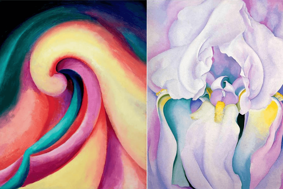
Georgia O’Keeffe was one of those artists who created images able to transport the viewer. From a young age I was captivated by her bold vivid gorgeous creations. She is one of the reasons I pursued an artist’s life.
In my twenties I was drawn to the intricate detail of cameos and decided to make a portrait of Georgia O’Keeffe with polymer clay.

This little creation reminds me of the strength and curiosity I admire in this artist.
Through the years of enjoying her work, it never occurred to me to wonder about her choice of pigments. I have seen clear pink, cyan, purple and green in her paintings but didn’t investigate how she was able to present these colours when the common understanding was to use red, yellow and blue as primary colours for paint mixing. If reds, yellows are blues are your go-to, it is impossible to find vivid magenta, pink, cyan, purple and green.
A few months ago I came across an image of one of her paintings. It was very vivid. More vivid than I remember her work being. The pink was PINK.

I messaged the Georgia O’Keeffe Museum asking about the possibility of the colours being altered digitally in the image. Of course many paintings you see on a screen will present different colours than you would see in person. It is likely in the case of this image, the saturation and colours were altered digitally. The museum sent me an interesting image of the colours separated from the painting and the pink appeared to be closer to red than magenta.
This got me wondering about the pigments on Georgia O’Keeffe’s palette.

After digging around in articles online, I found a list of paint colours she preferred.
They included Burnt Sienna, Purple Madder, Rose Madder, Raw Umber, Red Ochre, Yellow Ochre, Gamboge, Chrome Green (a mixture of Chrome Yellow and Prussian Blue), Cobalt Blue, Indigo, Zinc White, Terre Verte, Carmine, Manganese Violet, Viridian green, and Cerulean.
There they were. CMY popping up on her palette. She didn’t just focus on an RYB palette. She couldn’t if she wanted to represent the pinks, cyans, purples and greens she saw in her mind.
Purple Madder, Rose Madder and Manganese Violet hover around magenta.

Prussian and Cerulean are blues that are close to cyan.

Viridian is also close to cyan.
While I couldn’t find any mention of pigments that got very close to what would be considered a “primary yellow” on her palette, Gamboge comes pretty close and I have always found Yellow Ochre to be quite versatile and friendly for mixing.

It is interesting to explore the choices artists make for the materials they use. I’m keen to explore more about different artist’s colour choices and how it has impacted their work.

